It’s orange week
Well I have to say orange week took me by surprise. I hadn’t realised how many orange lovers there were out there! A lot is the answer. You guys sent in so many incredible photos of your homes. I’ve seen small orange pops to big orange walls and everything in between. If you’d like a nosy at them I have saved them on my highlights…take a looksee.
Orange is a bouncy juicy joyful colour. It has the energy of red and the happy vibes of yellow. Used in an interior setting it can ooze confidence and personality (lol sorry couldn’t think of another word for ‘ooze’).
See below for some wonderful orange inspiration from homes that have previously featured on Home Milk…

Orange and yellow sunshine
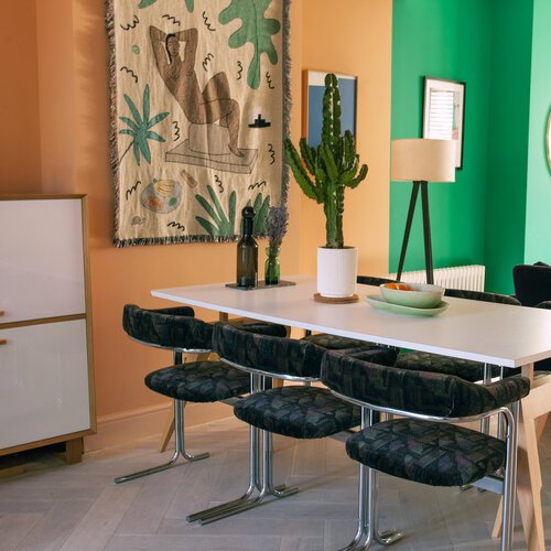
This is @mothsintherattan unbelievably cool dining room. She designed the storage herself and it took my breath away when I saw it. Definitely one of the most exciting kitchen/diners I have seen. And I have shot so so many homes now, so I’ve seen a lot. Big love for Danielle’s home.
To see more of Danielle’s home see shoot 68 on the grid

Charlottes locks shutters
This is the work of super talented @claregaskininteriors. The shutters were bespoke made and painted in ‘Charlottes Locks’ from Farrow and Ball and they make such a statement. It adds a bit of sass to this slick modern kitchen. I just love it!
To see more of Clare’s home see shoot 67 on the grid

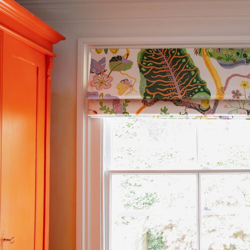
Totally tan
Thought I’d sneak onto the feature and include my dining room. I used an earthier orange tone called ‘Maple Tan’ from Valspar paints. It’s such an amazing colour, it goes from feeling really cool in the morning then heats up to a vibrant glowing orange in the evening. Brings me joy.
Image credit @npphotographer
My home is always popping up on the insta, most recently during shoot number 82

The juiciest orange
This was the first image that popped into mind when I thought about doing an orange week. It’s the front door of the super lovely @tootsdean. She painted it in ‘Electric Clementine’ and it got everyone very excited when I first posted it. Orange seems to be a popular choice for front doors, perhaps its a place where people feel more comfortable being bold.
To see more of Sarah’s home see shoot 26 on the grid
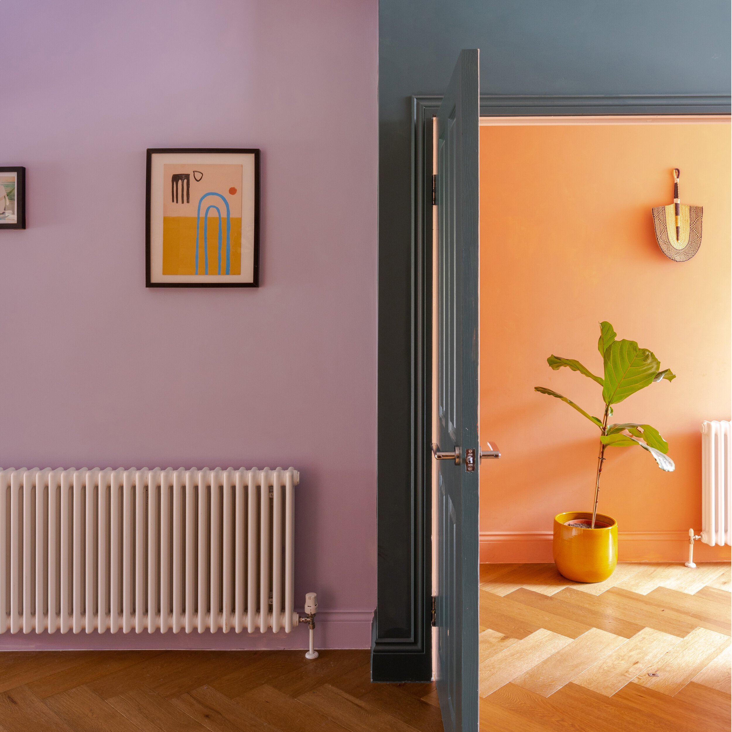
That orange glow
Oh the flow that is @emilybrooksuk hallway. Just look at that copper/terracotta warmth. What a way to make an entrance. I love how well it works alongside the blue and the lilac, such a fresh modern combination.
See more excitement from Emily’s home on the grid shoot number 80