
Inspirational images just for you…
New colour course info below
〰️
New colour course info below 〰️
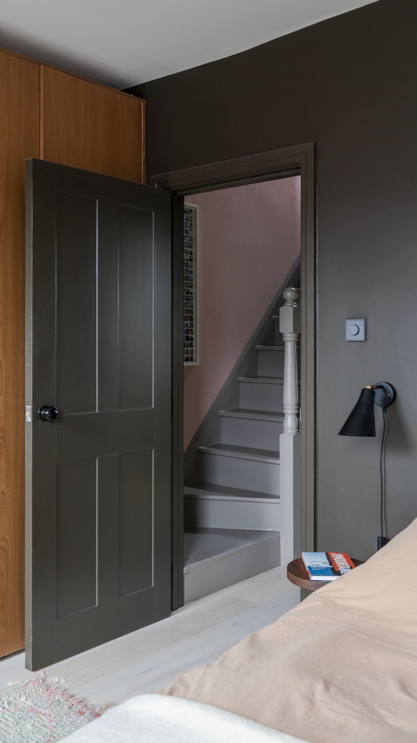
A deep grey can feel very grounding, the pink hallway lightens the mood.
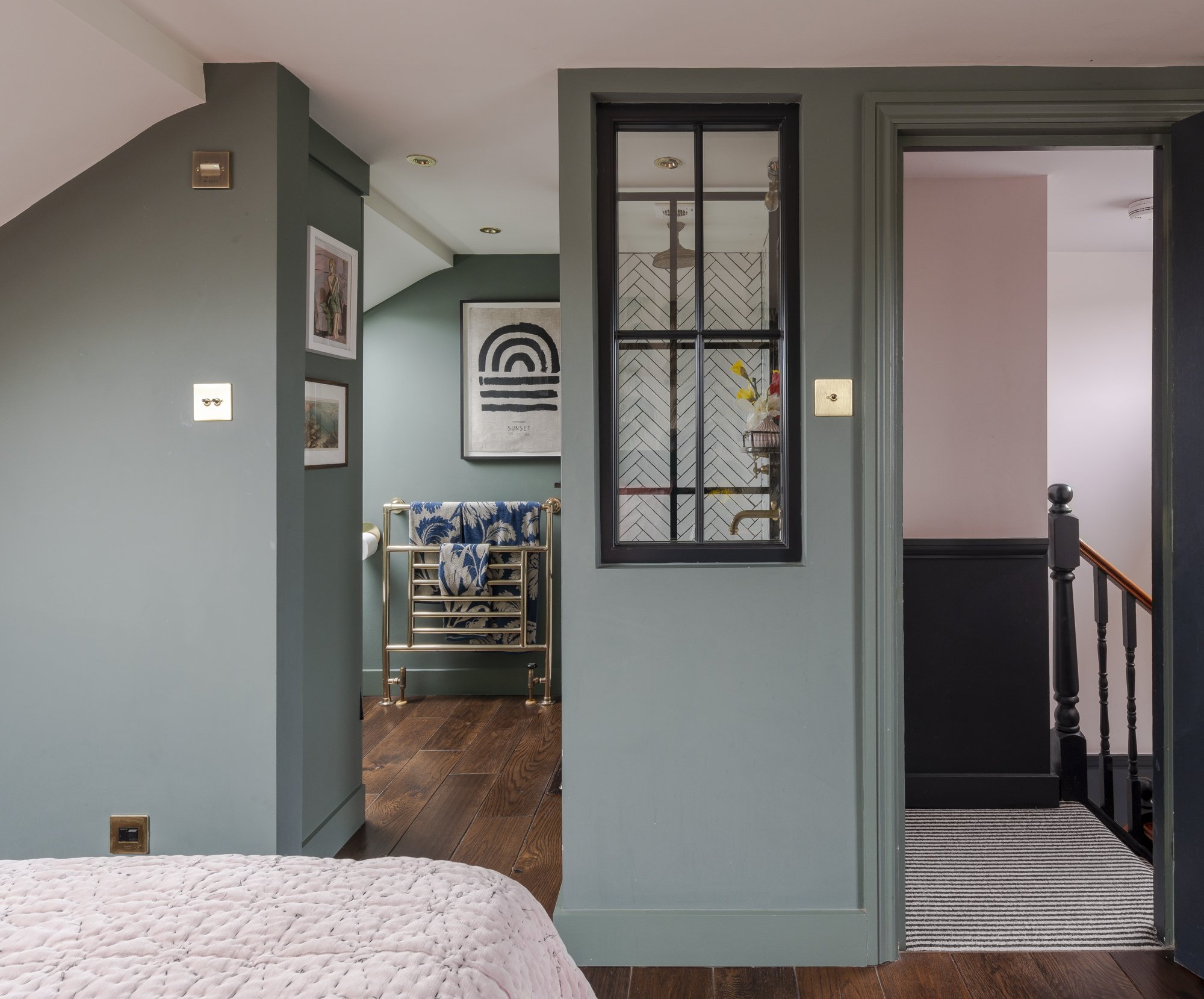
It's all about how the colours connect from room to room
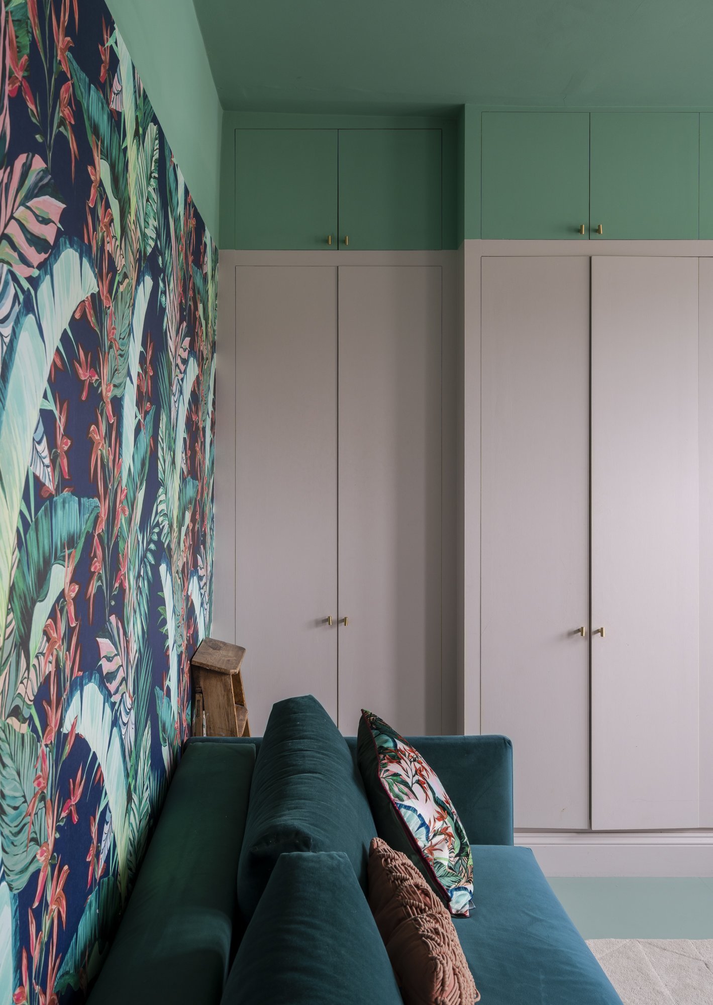
Dusty green is super soothing, ideal for a dreamy loft bedroom.
Putting a ‘lid’ of colour on your room will give a really modern edge.
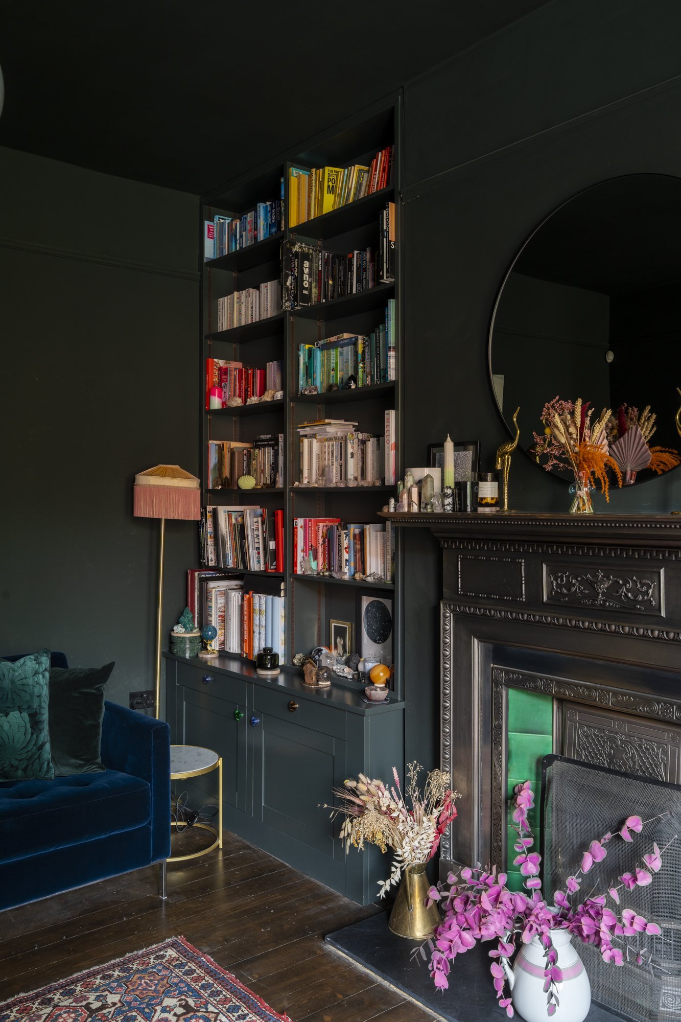
I love being dramatic, especially in the lounge! Look how these deep dark green lets the rest of the colours sing.
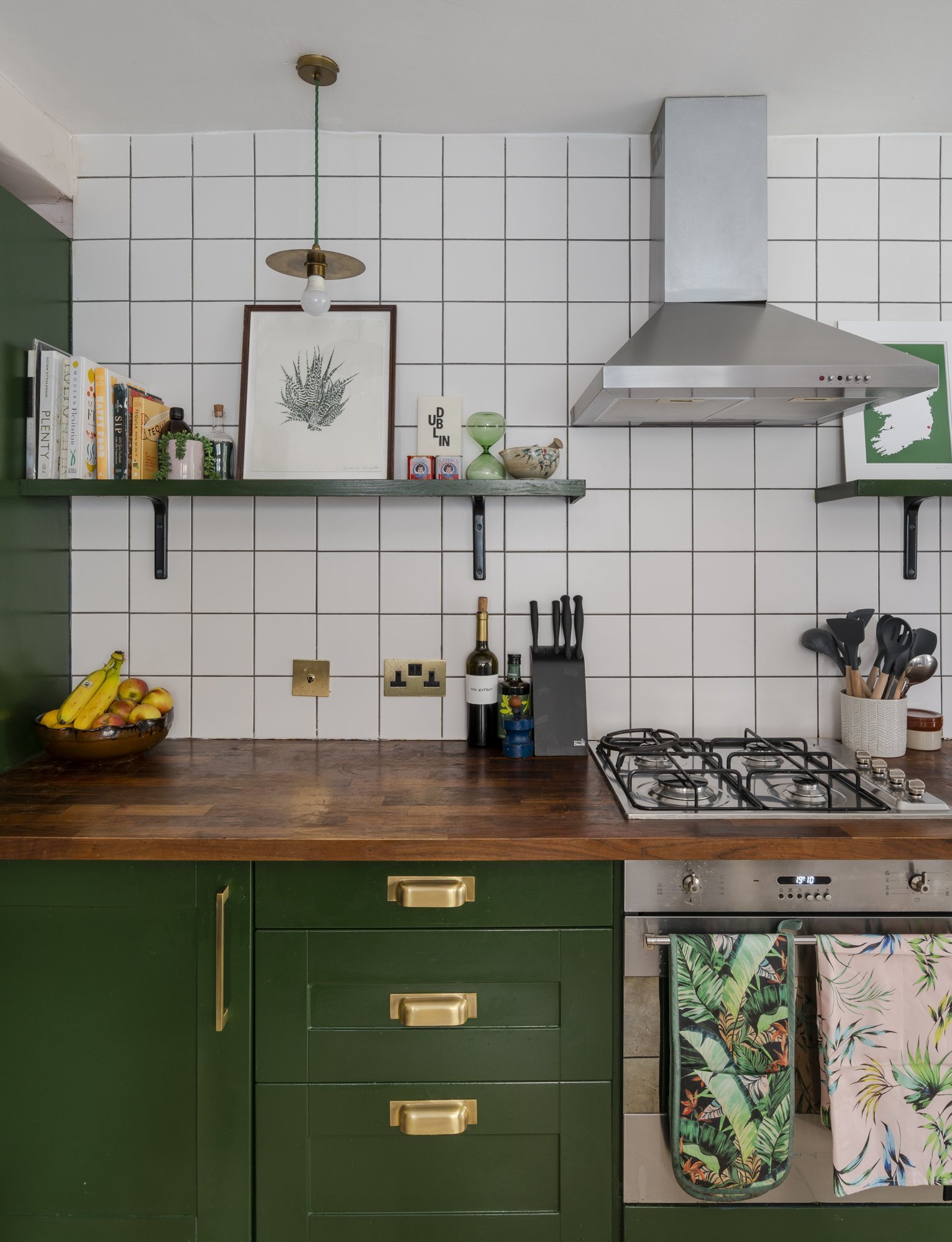
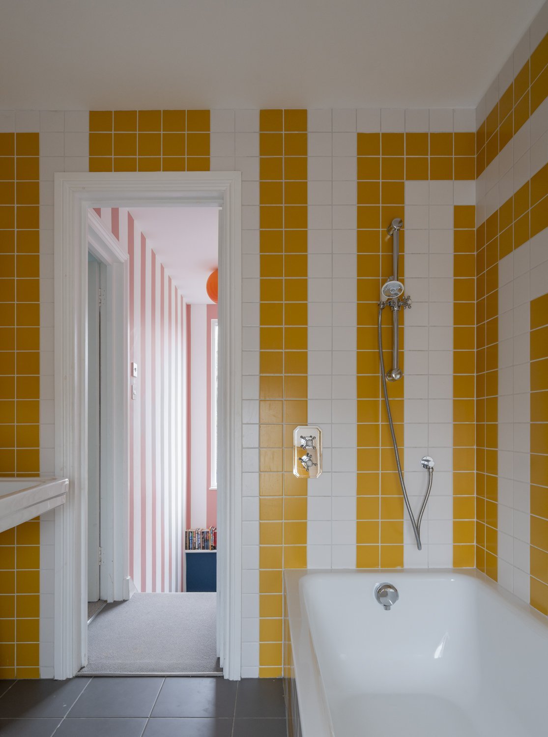
Vintage green and grid tiles are a match made in heaven
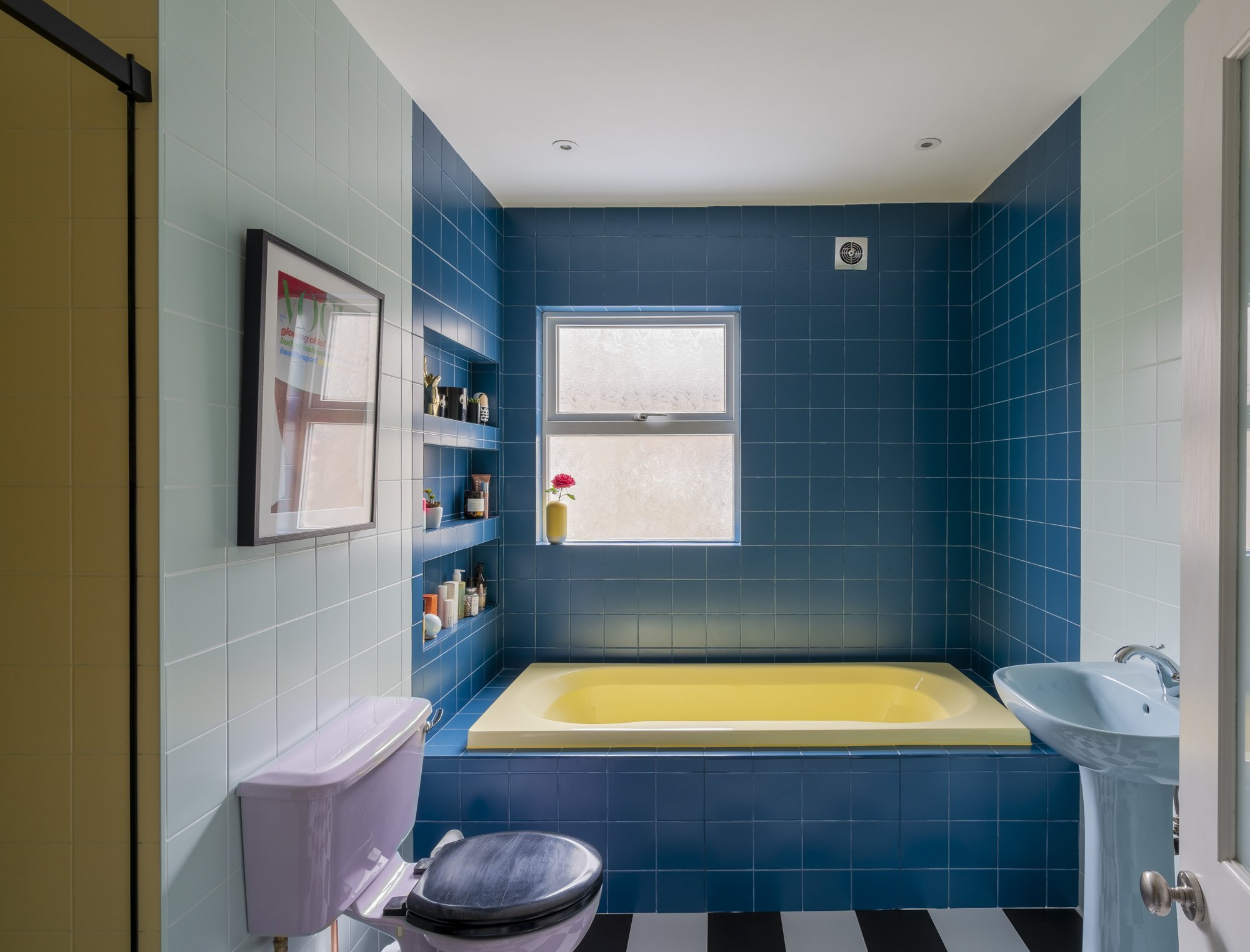
Colour blocking perfection and have you ever seen such a cool bathroom suite?!

Mossy green works so well in a bathroom, especially when plants are added for a very naturalistic feel.
Keeping the upper half one colour is an easy win when it comes to deciding where colours begin and end on a complex ceiling.
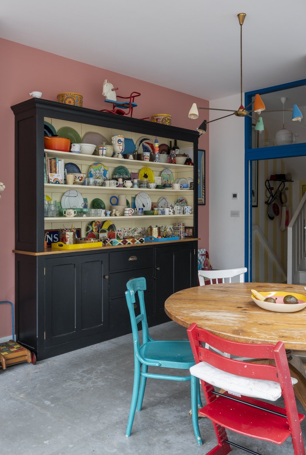
A dresser of dreams against a beautiful huggable pink wall
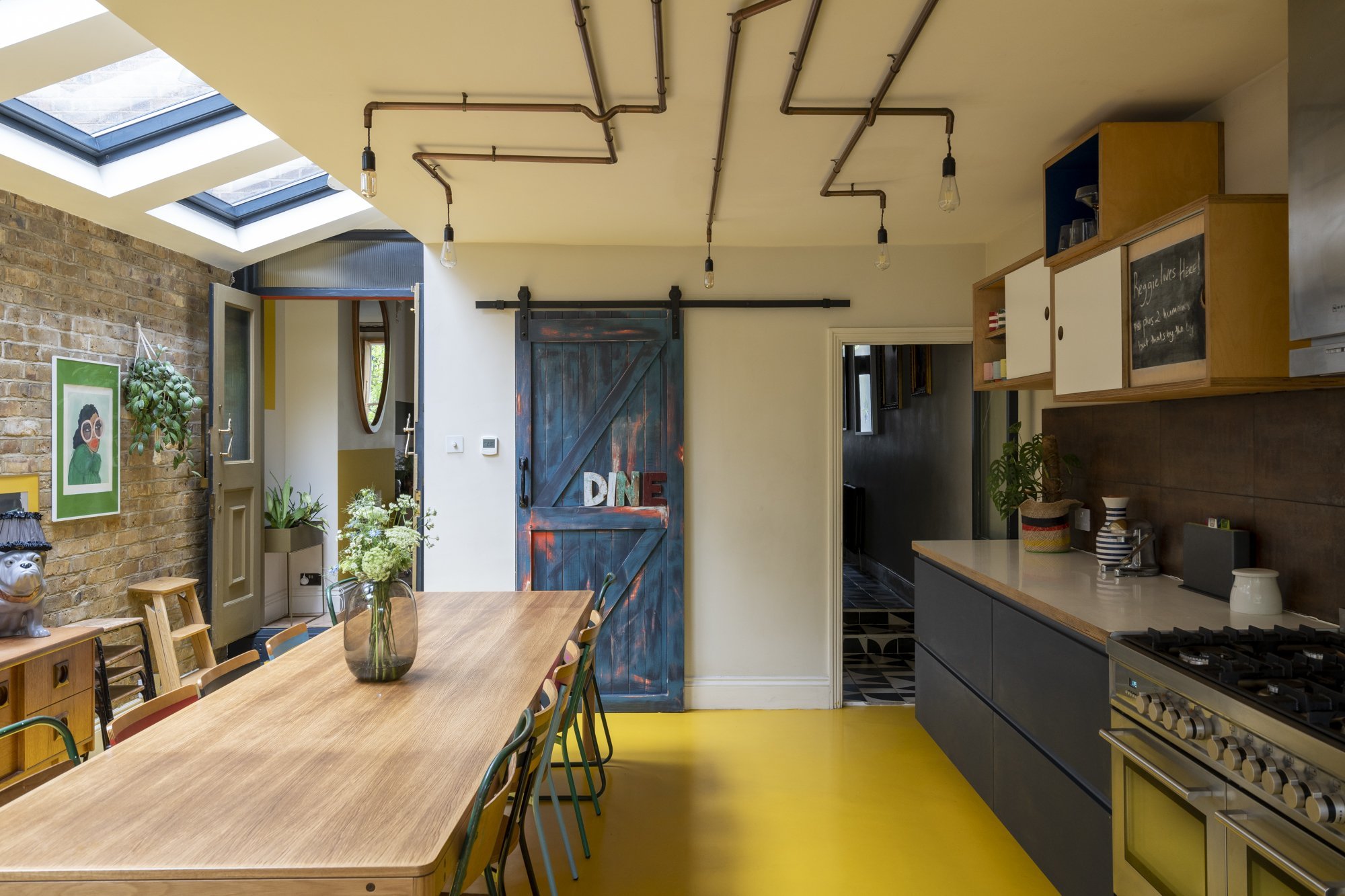
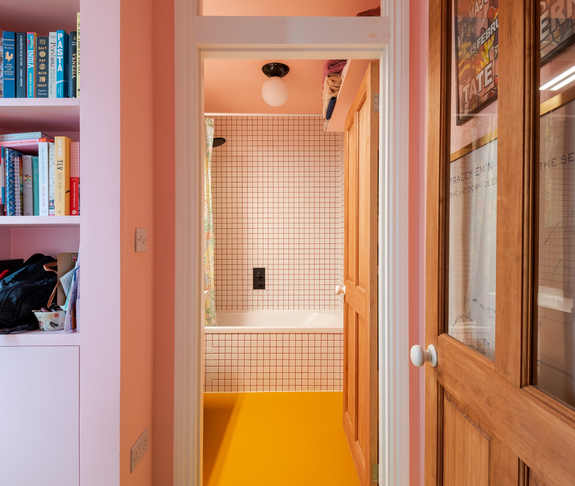
For continual sunshine whatever the weather, go for a big juicy yellow floor.
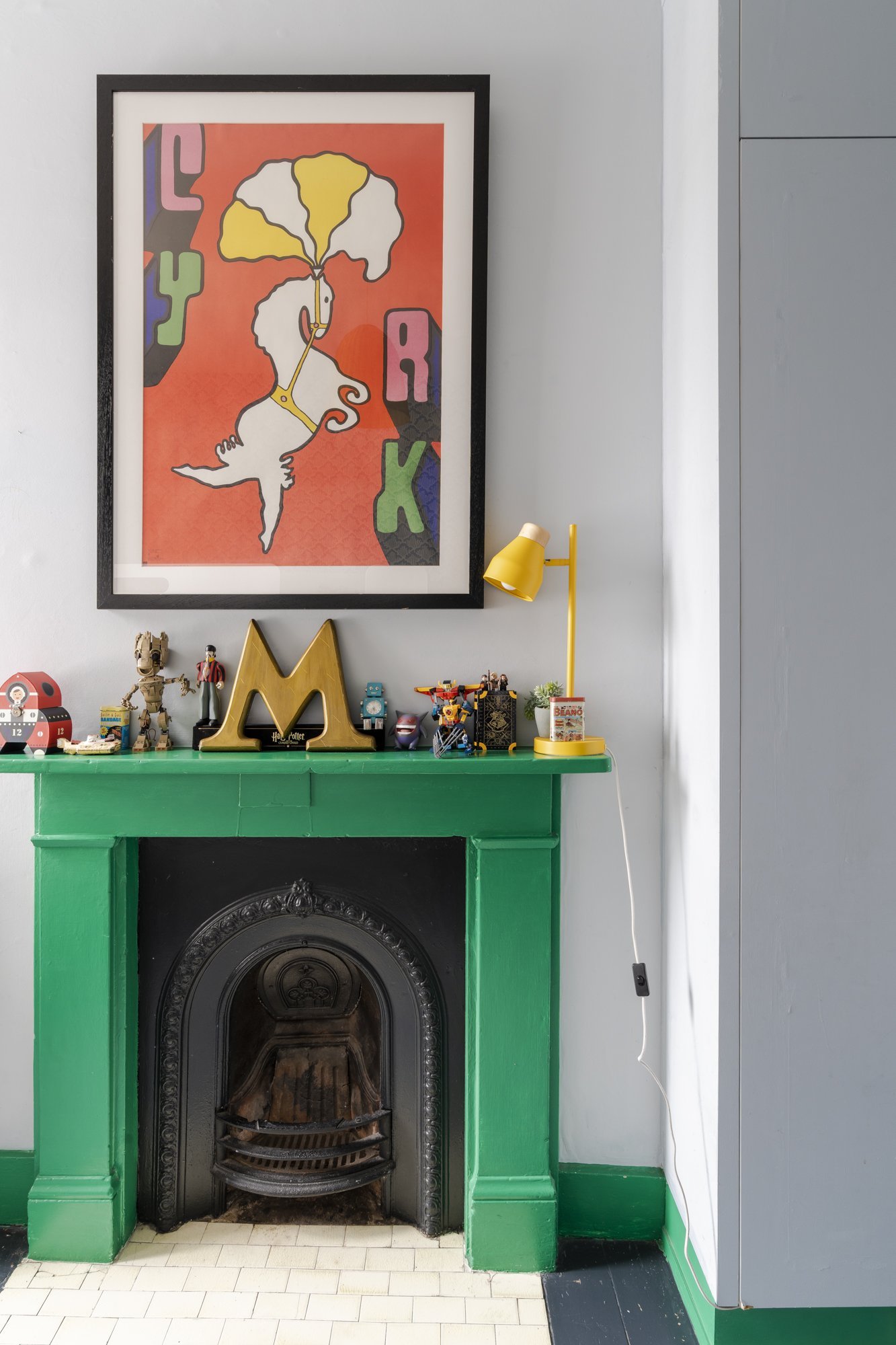
The perfect colour pop. I love how the fireplace surround colour continues across the skirting.
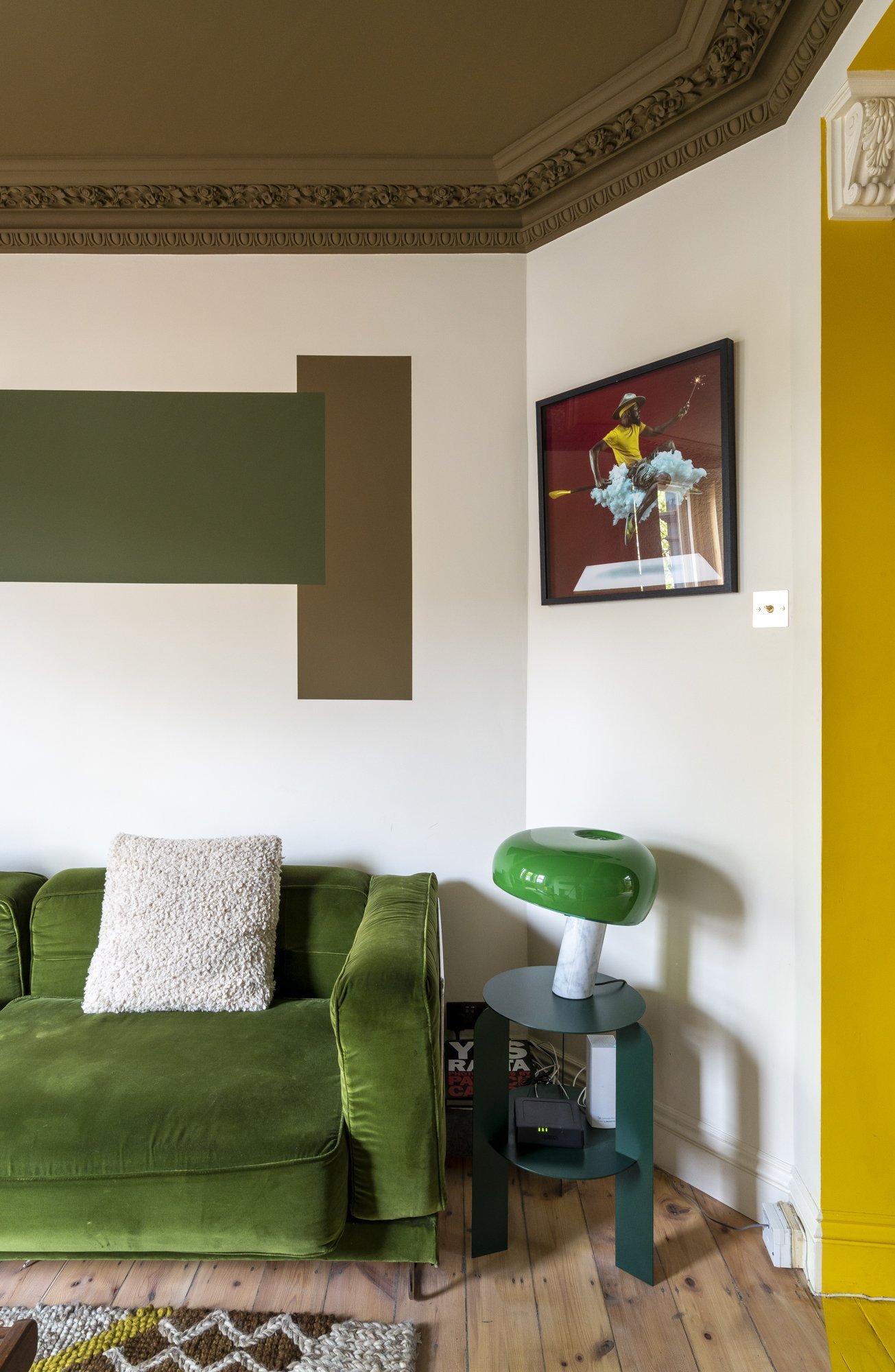
These shapes add energy to this room within a considered colour palette. The olive green ceiling is so beautiful.
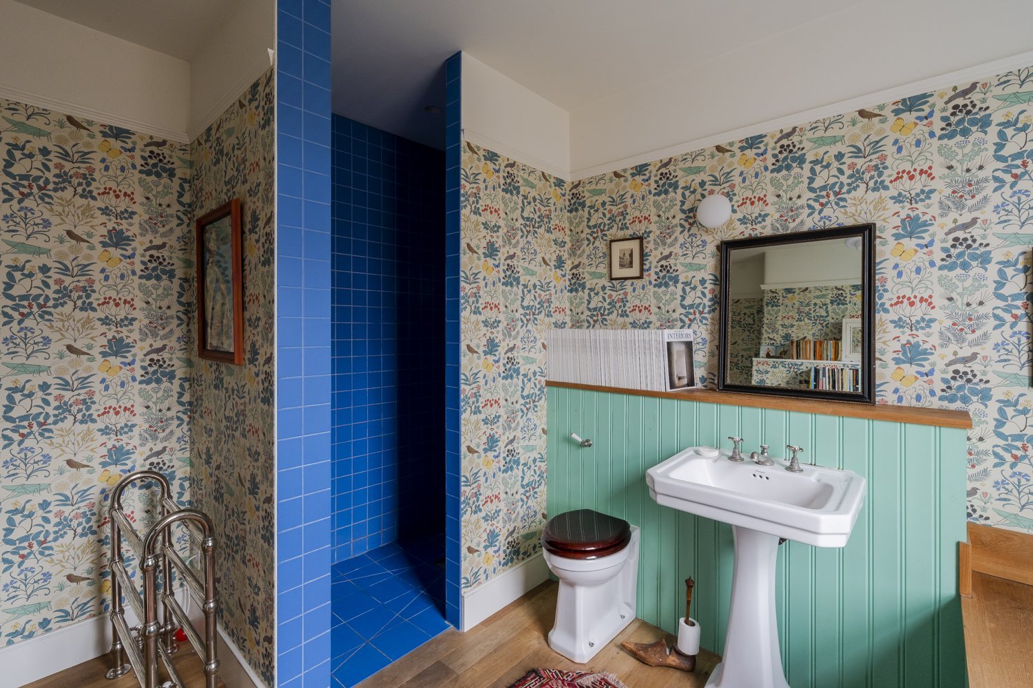
The blue tiles and green woodwork pick from the beautiful wallpaper for an eclectic but still cohesive feel.
Playing with colourful tiles is so much fun and can result in a masterpiece.

This beautiful blue is picked from Le Corbusier colour palette. It has a depth that draws you closer.
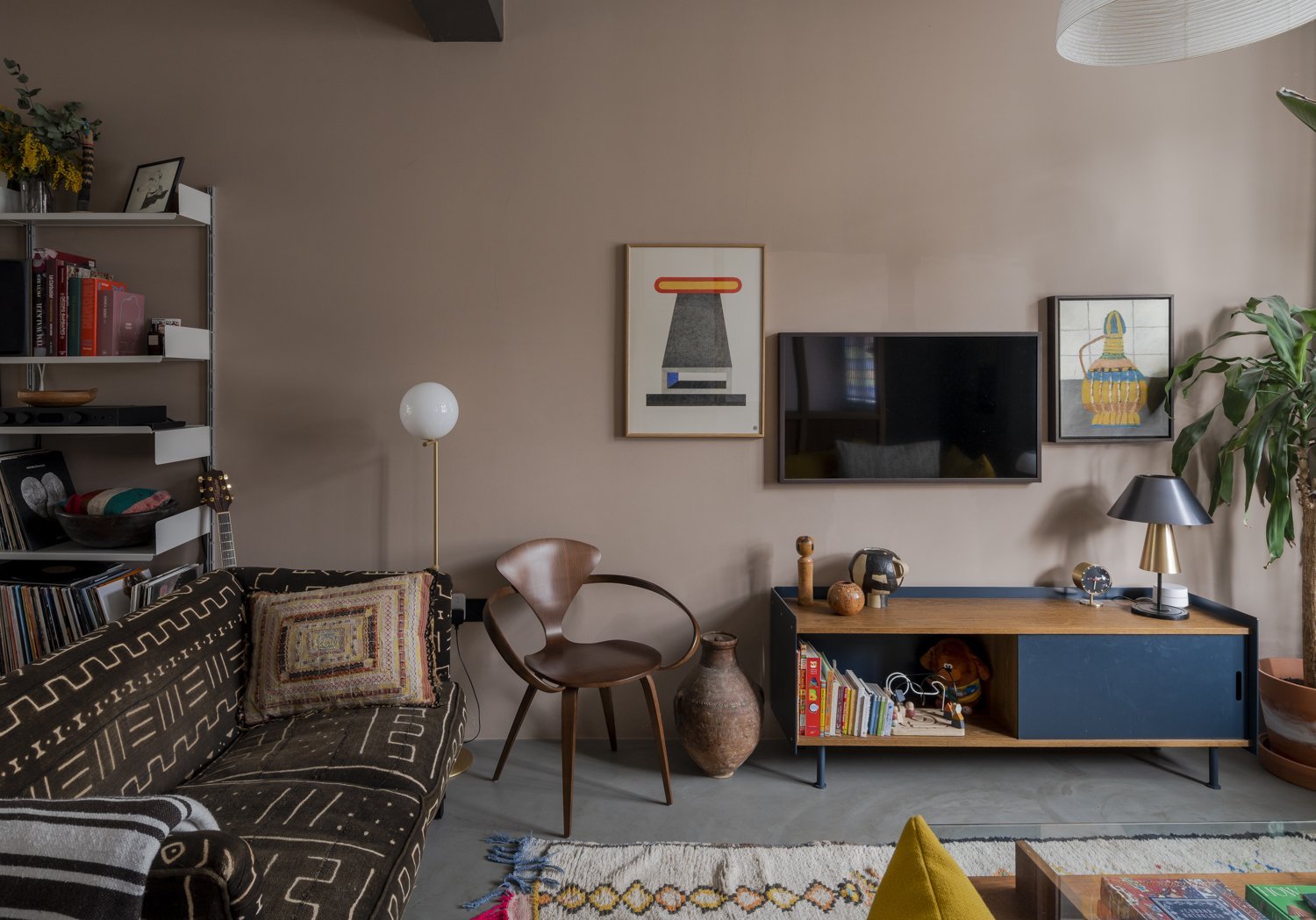
Nudey latte colours are great for ramping up the cosiness.
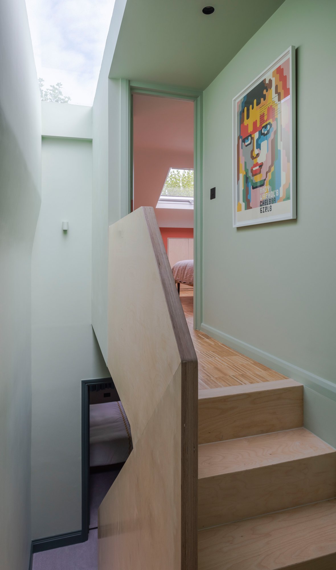
Floor to ceiling pale green works so well in this hallway. It shifts to a lighter tone as it reaches the roof light.
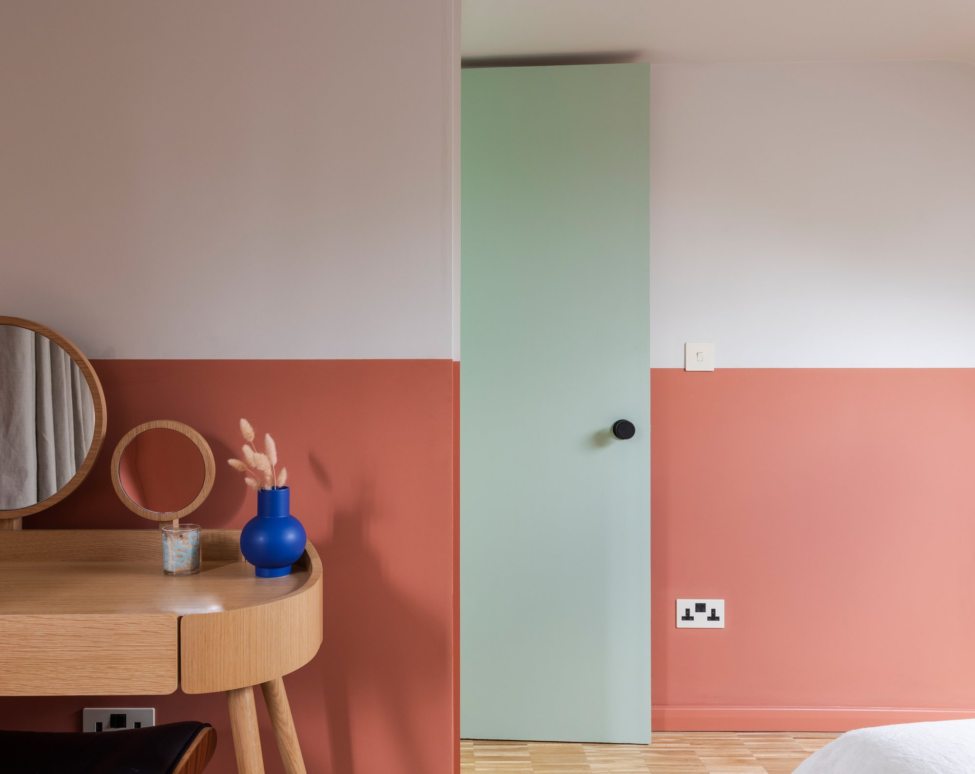
Terracotta and green should always be seen. It’s always good to consider the juxtaposition of colours when you open a door.
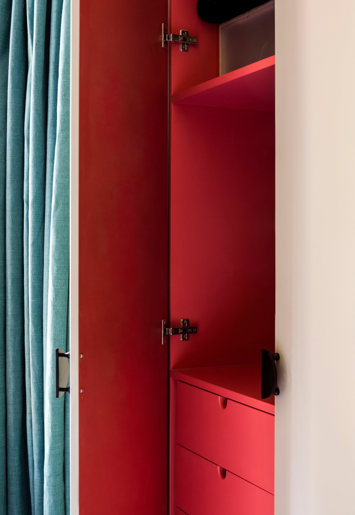
Making that extra effort to add colour in surprising places will add the fun factor to your home.
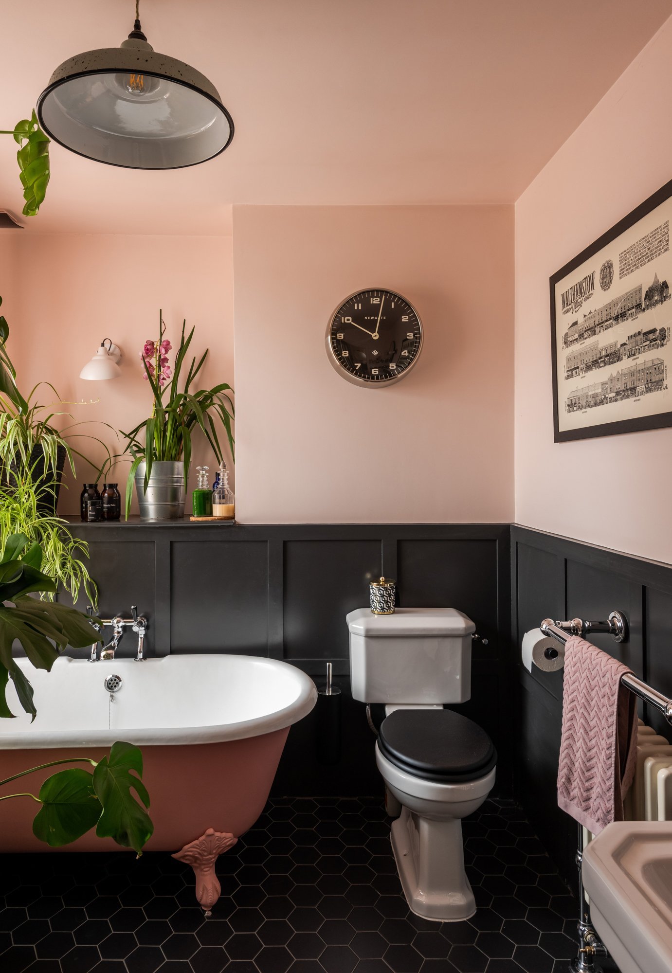
Go on, paint your bathtub, you won’t regret it!
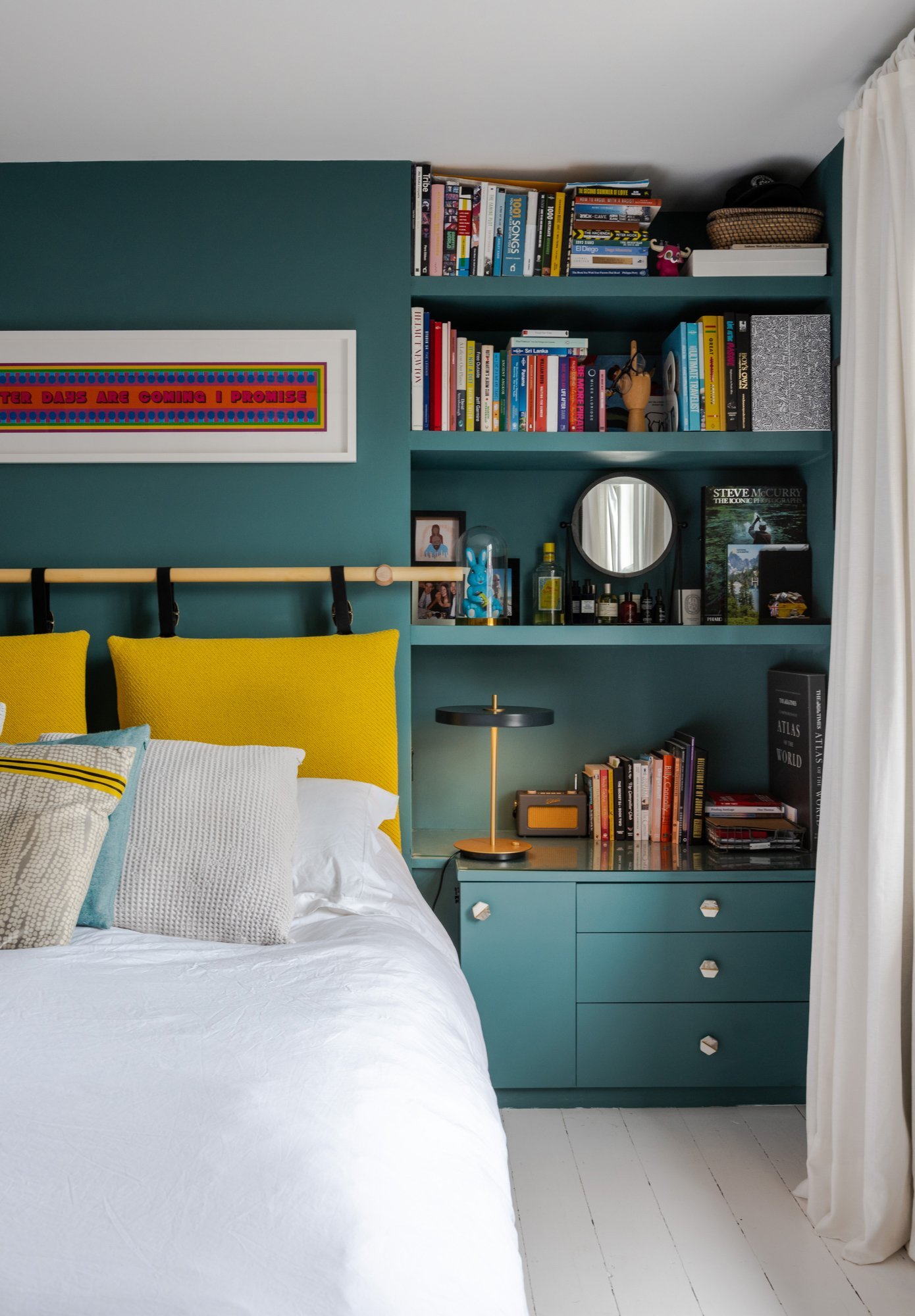
Painting the woodwork and walls all the same colour helps create a restful backdrop for all your knick knacks. Here it also lets the yellow pop.
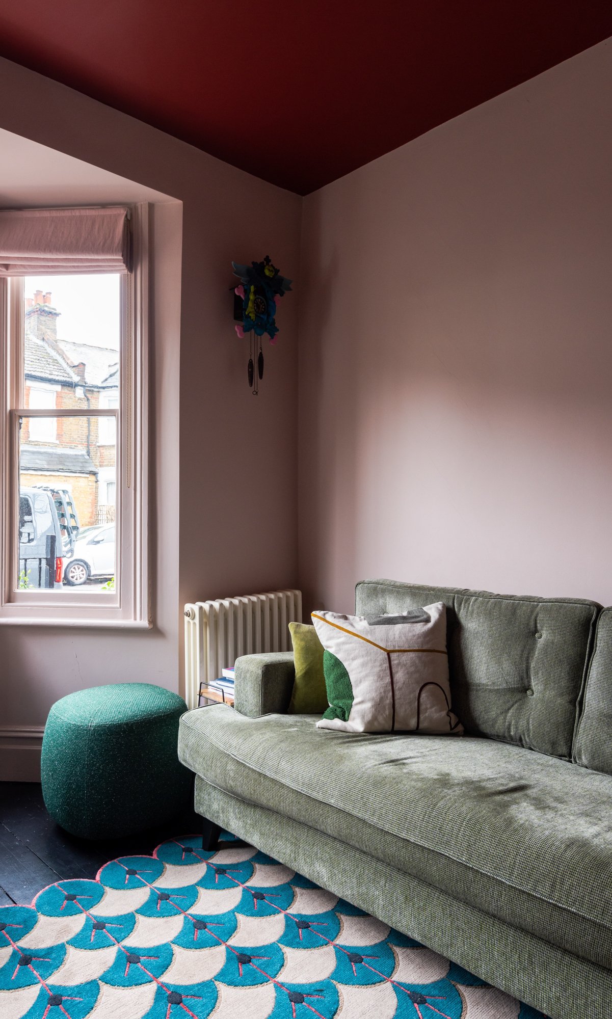
This dusty pink feels so nurturing. You are fully cocooned by the incredible deep red ceiling.
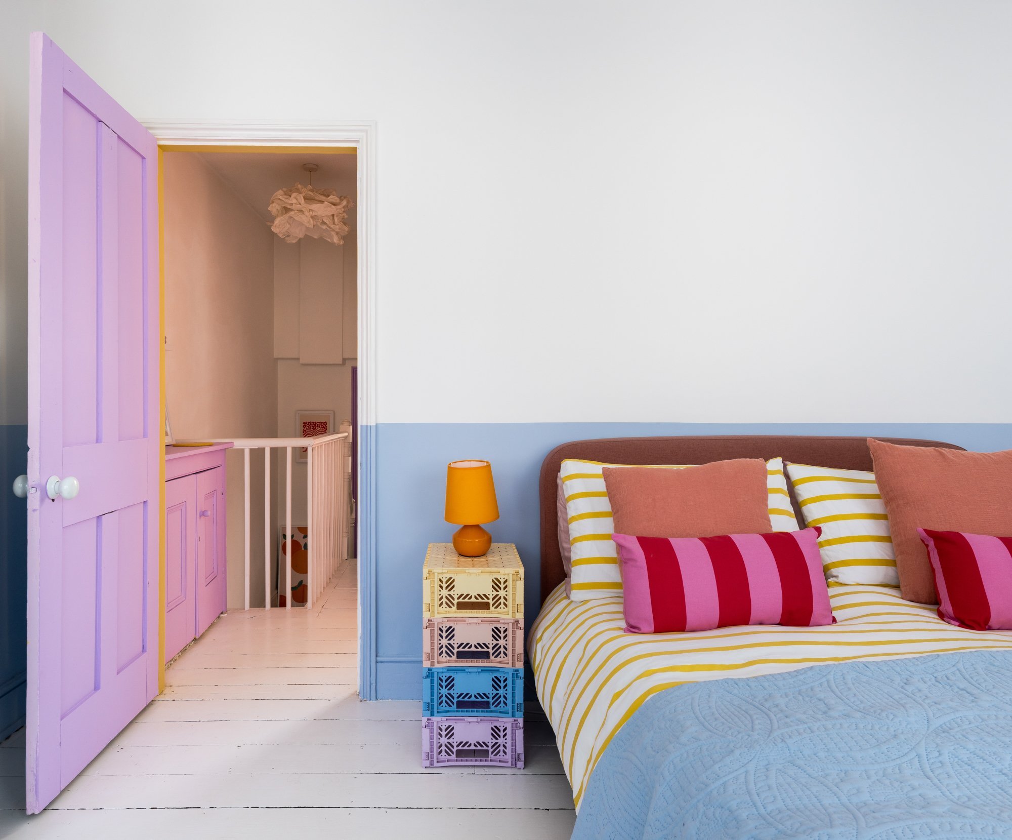
This blue is the perfect restful tone for this pastel toned home. Painting the lower half of the wall is a great way to add a splash of colour without overwhelming.
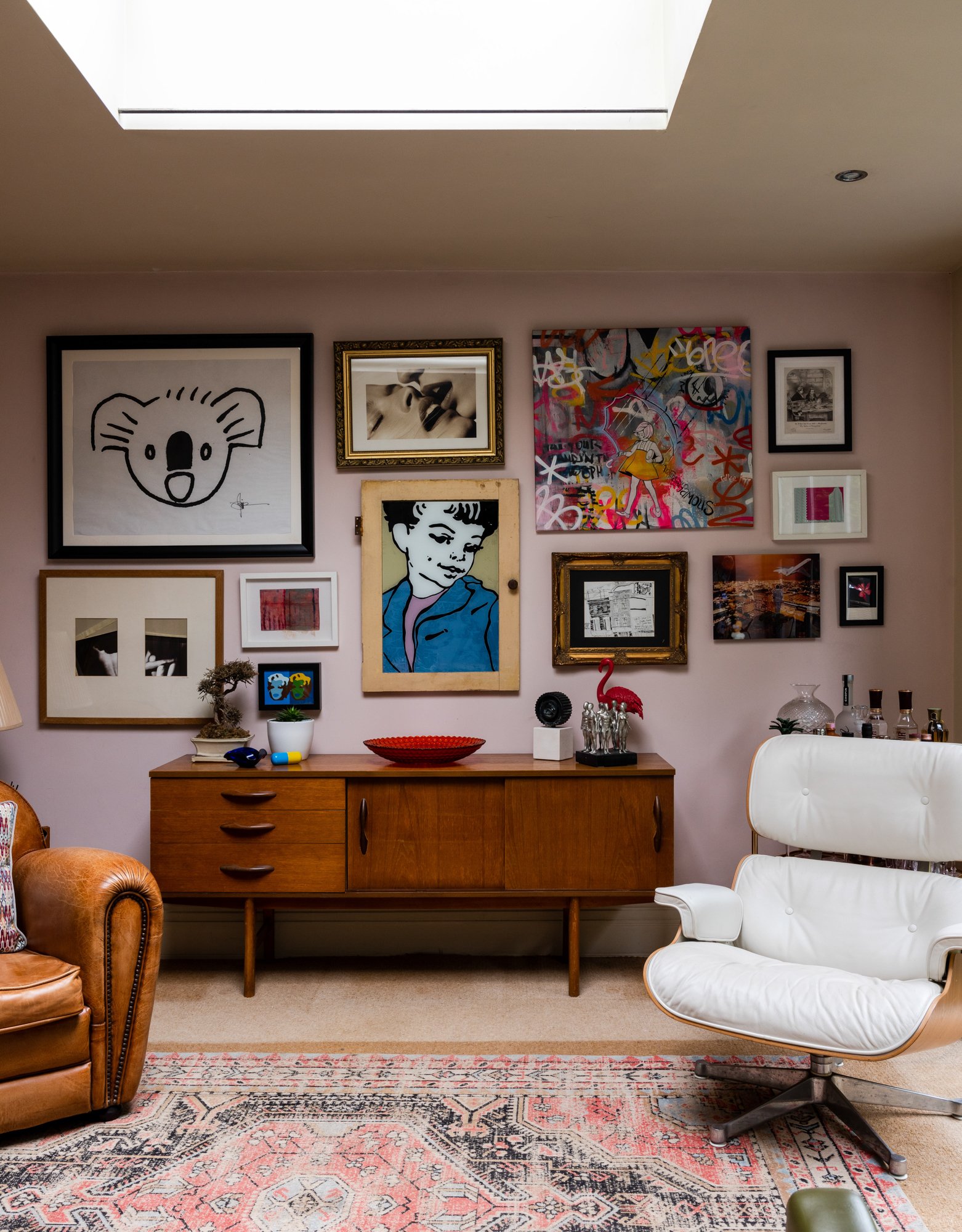
A pink backdrop for a super cool gallery wall
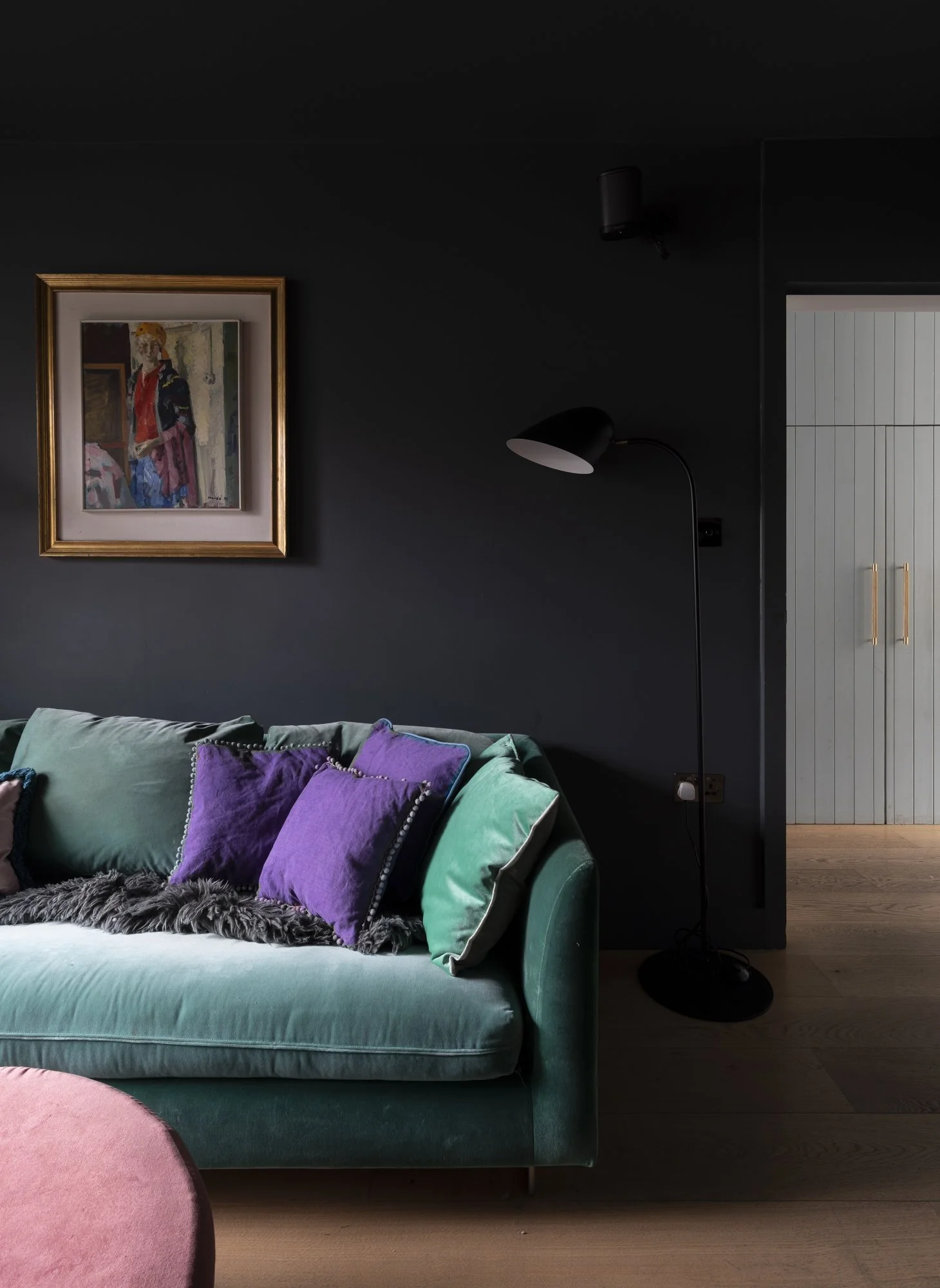
The darkest black is perfect for making your furniture colours pop

I just had to show you a close up of this hand painted wall mural in a kids bedroom

@barbara_ramani_interiors went next level with her hallway, a hand pained memphis masterpiece

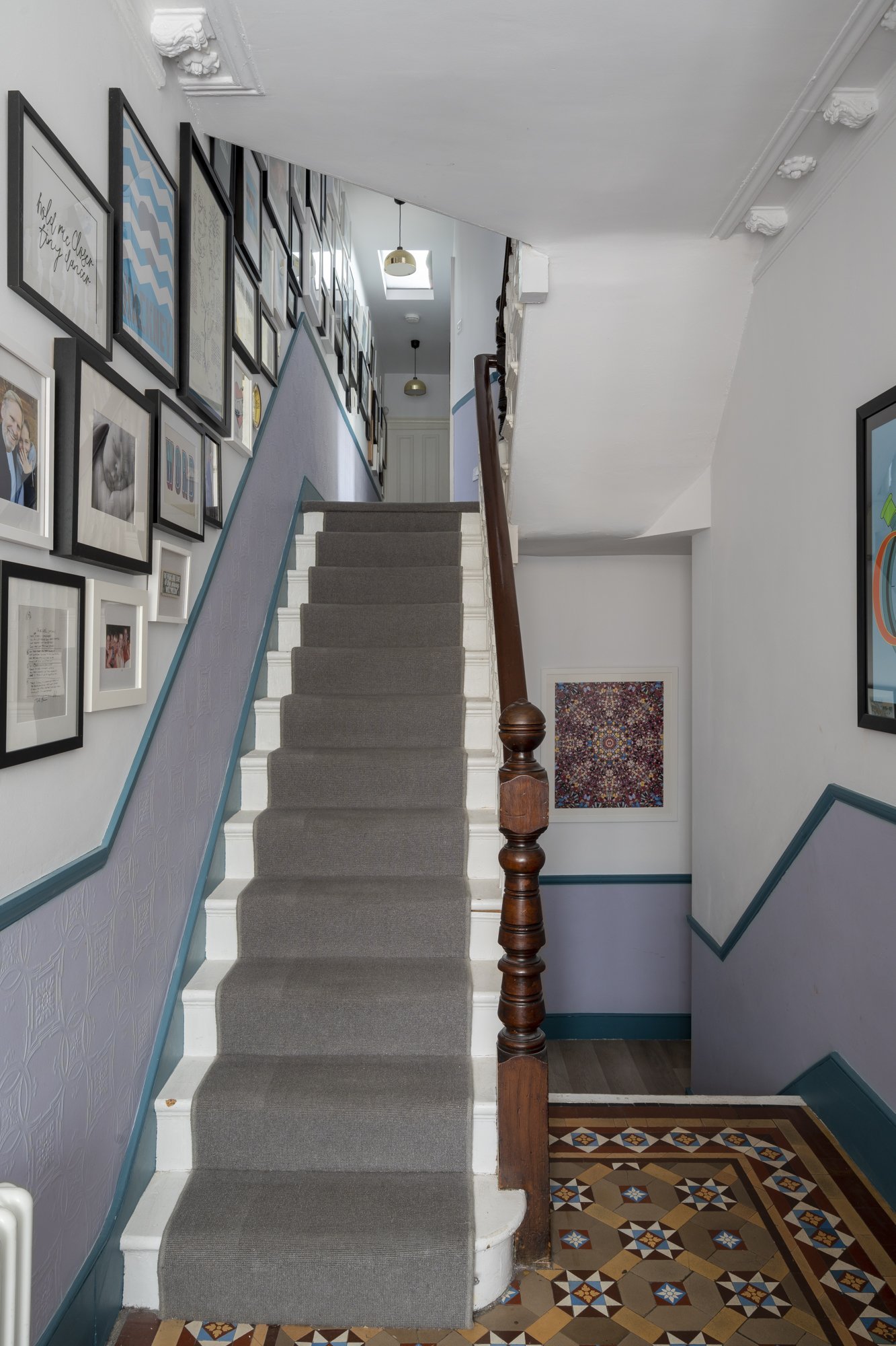
The dustiest of pinks amps up the vintage feel in this beautiful hallway

Corbusiers 'Blue Outremer' is the most perfect of blues
Join the waitlist
〰️
Join the waitlist 〰️
New online course:
Colour Your Home With Confidence
So you love colour but get lost in the wild amounts of inspiration out there? You have great taste but sometimes don’t know where to start? Let me guide you through the noise and help you find colours that not only look incredible but also make your heart sing.

